
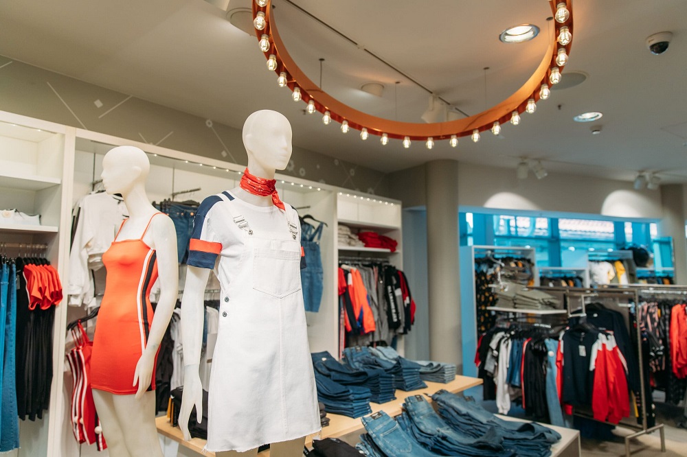
Every detail of a modern grocery store or retail environment is intentionally engineered to guide consumer movement, shape psychological focus, and maximize spending. From the moment a shopper steps through the sliding glass doors, the spatial arrangement of aisles, lighting, product height, and olfactory cues quietly direct purchasing decisions.
While most individuals believe they are executing a rational, planned shopping trip, retail architecture subtlely encourages impulse buys and extended store visits. Understanding the behavioral science behind store layouts reveals how floor plans transform simple errands into carefully managed commercial journeys.
The Entryway and the Decompression Zone
The physical transition into a retail space is designed to slow down the human mind. The first fifteen to twenty feet inside a store entrance is known in environmental psychology as the decompression zone.
In this space, shoppers adjust their walking speed, absorb lighting levels, and transition from the outer world into the shopping environment. Retailers purposefully keep this area relatively open and free of high-priority inventory, as consumers rarely purchase items located in this initial entry threshold.
Immediately following the decompression zone, stores present high-margin, visually appealing departments to establish a positive psychological baseline.
-
Fresh Produce at the Front: Placing vibrant fruits, vegetables, and floral arrangements near the entrance creates an immediate impression of freshness and health. When shoppers load their carts with wholesome items first, they feel a subconscious sense of license to purchase processed foods or indulgent snacks later in the trip.
-
Prepared Foods and Bakery Aromas: The scent of freshly baked bread or roasted chicken strategically activates appetite signals. Smelling food upon entering increases saliva production and triggers impulse purchasing across subsequent aisles.
-
Large Cart Availability: The simple availability of oversized shopping carts encourages consumers to fill the empty space, subtly altering perception around how much merchandise is appropriate to buy.
Counter-Clockwise Traffic Flow and Wall Anchors
Retailers consistently design store layouts to guide traffic in a counter-clockwise direction. Psychological research indicates that in countries where people drive on the right side of the road, shoppers naturally prefer navigating retail spaces moving toward the left and circling around counter-clockwise.
This specific movement keeps the majority of the store on the shopper’s right side. Because most people are right-handed, items placed on right-hand shelves receive greater visual focus and are significantly easier to reach and grab without stopping.
To ensure shoppers traverse the entire perimeter of the store rather than taking shortcuts, retailers strategically position essential staple items at extreme opposite corners.
-
Dairy and Milk Placement: Essential items like milk, eggs, and butter are almost universally located at the furthest back wall of the supermarket. To retrieve a basic carton of milk, a customer must walk past dozens of displays filled with processed snacks, seasonal items, and promotional endcaps.
-
The Perimeter Circuit: High-profit departments such as meats, cheeses, and specialty delis line the outer walls. This forces shoppers along a continuous perimeter loop, exposing them to high-ticket items before they ever enter the central dry-goods aisles.
Shelf Mechanics: Eye Level Is Buy Level
Within individual aisles, spatial arrangement becomes granular. Shelf positioning is one of the most rigorously analyzed real estate factors in consumer product sales. Manufacturers pay substantial slotting fees to secure prime shelf space, knowing that physical placement directly dictates sales volume.
The Eye-Level Tier
The third shelf from the bottom, positioned roughly four to five feet off the ground, is universally recognized as the prime visual zone. Items placed in this zone experience the highest conversion rates because they require zero physical effort to see or reach. National brands, premium specialty products, and high-margin inventory routinely occupy this space.
The Children’s Eye-Level Tier
Directly below the prime eye-level tier sits the child-focused zone, positioned roughly two to three feet high. Retailers purposefully stock sugary cereals, branded character snacks, and colorful novelties on these middle-to-lower shelves. This placement ensures that children riding in carts or walking alongside parents can easily spot and request specific products.
Top and Bottom Shelves
The very top shelves are reserved for niche brands, regional items, or specialty goods that consumers actively seek out regardless of visibility. The lowest shelves house bulk items, heavy oversized packaging, and generic or store-brand alternatives. Because shoppers must physically bend down to inspect these bottom shelves, generic items remain less visible, protecting the profit margins of branded equivalents above.
Endcaps, Island Displays, and Impulse Architecture
The ends of aisles, known as endcaps, represent prime promotional real estate. Because endcaps face the primary perimeter thoroughfares, every shopper passing down the main walkways must look at them, regardless of whether they enter the specific aisle.
-
Perceived Discount Bias: Consumers naturally associate endcap placement with promotional pricing or sales. However, products displayed on endcaps are frequently regular-priced items that manufacturers paid to feature, exploiting the consumer’s assumption of a deal.
-
Dump Bins and Island Displays: Unstructured displays placed directly in main aisle pathways force shoppers to alter their walking trajectory. These physical speed bumps disrupt quick navigation and compel customers to look down, encouraging spontaneous item selection.
-
Cross-Merchandising Tactics: Retailers group complementary items together outside their primary categories. Placing tortilla chips directly adjacent to salsa displays, or positioning wine openers next to the artisanal cheese case, prompts unplanned add-on purchases through convenience association.
The Checkout Line and the Captive Audience
The checkout area represents the final psychological barrier in the store layout. At this stage, shoppers experience decision fatigue from evaluating dozens of choices throughout their visit.
Retailers capitalize on this reduced willpower by constructing narrow, single-file queuing lanes flanked on both sides by high-margin impulse items. Magazines, cold beverages, candy bars, travel-sized toiletries, and gift cards fill these tight spaces.
Because shoppers are stationary while waiting in line, their dwell time in this area is higher than anywhere else in the store. The physical layout forces close contact with low-cost indulgences, making it easy to grab a final reward before completing the transaction.
Frequently Asked Questions
Why do grocery stores constantly rearrange their floor layouts?
Grocery stores periodically alter product placement to disrupt consumer muscle memory. When shoppers become familiar with a layout, they navigate automatically, purchasing only planned list items. By shifting inventory location, stores force customers to search through unfamiliar aisles, exposing them to hundreds of additional products and increasing the likelihood of impulse buys.
How does store lighting affect shopping behavior?
Lighting is calibrated to influence customer mood and product perception. Bright, warm lighting in produce sections highlights colors, making fruits and vegetables appear fresher and more appealing. Conversely, softer, warmer lighting in bakery or wine sections creates a relaxed, upscale atmosphere that encourages lingering and higher spending on premium items.
What is the purpose of playing slow-tempo music in retail stores?
Background music is carefully selected to regulate physical walking speed. Slow-tempo music subconsciously lowers heart rates and slows down walking paces, causing shoppers to spend more time browsing aisles. Research consistently demonstrates that the longer a customer stays inside a store environment, the more items they ultimately place in their cart.
Why are high-volume staples like bread rarely placed next to milk?
Separating everyday staples forces customers to traverse multiple sections of the store to complete basic shopping lists. If bread and milk were situated in adjacent cases, shoppers could enter, pick up both items, and exit within minutes. Placing them on opposite ends ensures maximum store exposure during quick errands.
How do floor tile choices influence shopper movement?
Retailers use varied flooring textures and patterns to alter consumer movement speeds. Smaller floor tiles placed in expensive departments create a rapid clicking sound with shopping cart wheels, tricking shoppers into believing they are moving too fast. This subconscious feedback causes them to slow down and spend more time evaluating high-margin inventory in those specific areas.
What is a racetrack store layout, and why do department stores use it?
A racetrack layout features a prominent, loop-like central pathway that guides customers through distinct departments in a predetermined sequence. Department stores utilize this layout to prevent shoppers from walking straight to a single section and leaving. By forcing consumers along a guided path, stores maximize exposure to apparel, home goods, and cosmetics along the main route.
How does cart size directly impact consumer spending?
Larger shopping carts distort spatial judgment, making normal grocery purchases look sparse inside the cart volume. This visual imbalance creates a subtle psychological desire to fill the remaining space, prompting customers to select extra items they did not originally intend to buy.